Our evolved brand identity is a reflection of Anderson’s past, its present and its future. It redefines and visually communicates the values that reflect Anderson’s mission — a long family history of care and role as protector, commitment to healing, strong beliefs in the values of faith and compassion and the three distinct groups of people we depend on daily to carry out the Anderson legacy. Our identity elements are used to visually represent the Anderson brand and we use them to tell our brand story through a very distinct point of view or perspective. The Anderson Regional Health System logo represents our mission: to continue our heritage of healing and improving life for the people we serve.

The crest or shield is a stately and dignified symbol associated with family, a long history and deep roots. The shield is also the symbol of a protector, a safe haven, an entity that preserves the well-being of those who may not have the ability to protect themselves. Our shield represents our mission: to continue our heritage.
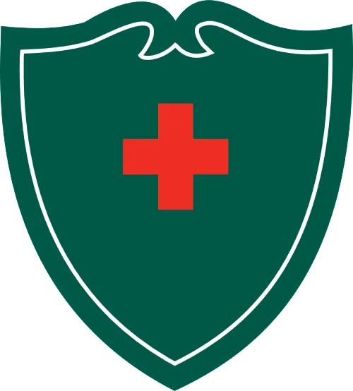
Our mission of healing includes reaching out to those who suffer the afflictions of all manner and form. It is that commitment to the value of human life that has made Anderson the institution it is today. At the very core of Anderson is the red medical cross, a symbol known around the world for healing, protection, and safety — the very things Anderson has represented throughout its history.

But Anderson is about more than healing the human body; it is about healing the human soul, of reaching out to those who seek compassion and are in need of mercy, those who yearn for the warm touch of a nurse, or a kind word from a doctor. The Christian cross is a symbol recognized around the world by all faiths as a sign of hope and love, helping others, especially the least of these.

To improve the lives of the people we serve takes a team. This team of healers — those who carry on the legacy of compassion Anderson has spent years building — is our PEOPLE. Healing waters have a rich history in all faiths and countries around the world. These waters represent a renewed spirit and body, a new day of hope. For Anderson, the three waves of healing waters represent the three groups who make healing possible: from the base of the waves reaching upward, the waves represent our Physicians, our Caregivers and our Support Team.
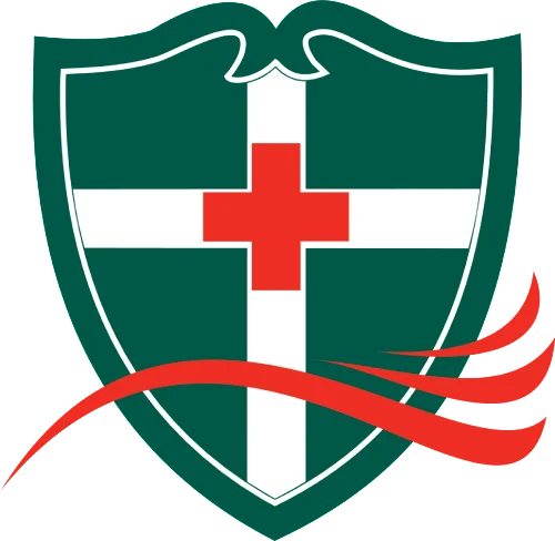
Green conveys our commitment to renewing the body and spirit, as well as our efforts to care for the planet and our community. Green also conveys hope, a new day and growth for our people and our institution. Red is a rich, deep color and is a perfect complement to the green. Red is associated with many of our values that include love of mankind and strength of character, and is the symbol of medical care throughout the world.
Anderson Regional Health System offers a wide range of medical services, including cancer, cardiac, pediatric, surgical, and trauma care. Our healthcare professionals are committed to improving the lives of those we serve.
©2022 Copyright | Website Privacy Policy | Digital Marketing by Authority Solutions®